Interactive 3D globe Day 8 · HDX
Food insecurity, classified
Global Food Insecurity
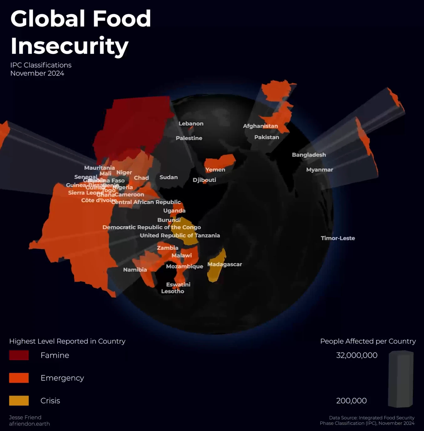
An interactive globe of the IPC food insecurity classifications from November 2024, showing the highest phase reported in each country and the number of people affected.
A closer look
For the Humanitarian Data Exchange day of the 30 Day Map Challenge, I mapped the Integrated Food Security Phase Classification (IPC). The ongoing crisis in Sudan, where more than 21 million people faced acute food insecurity and famine was present in several regions, shaped my choice of topic.
These crises are often overlooked in Europe and the US. Each country is colored by the highest phase it reported, from crisis to emergency and famine, and rises in proportion to the number of people affected, from 200,000 to 32 million.